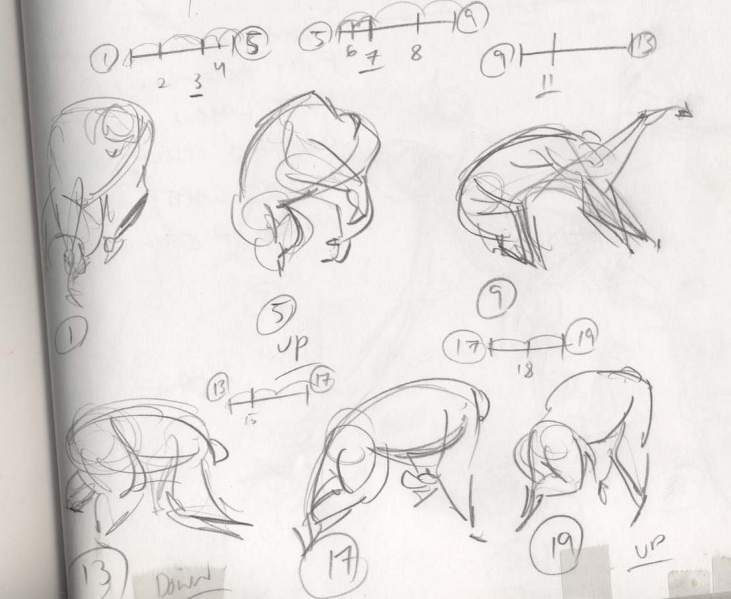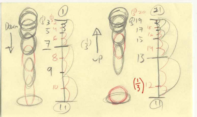
Ahhh, the infamous ball bounce. But there is much to learn from this simple animation exercise. Physically speaking, it's got most of the animation principles rolled up into one test. But today i will focus on spacing, planning for ones, and contact.
Spacing is obviously half of what will or will not make this work. Note that the chart on this ball bounce is not the same for both the "up" and the "down". On the Down I made the dropping slightly more 'even' than the bounce back on the 'up'. It seems to me to feel more natural, and the sharp gap in spacing on the up give the ball a feeling of intention, like it's really trying to bounce. The only problem with the spacing is the gaps. BTW, All lines in graphite are the odd's (on 2's), and the reds and the added inbetweens for ones. Anyway, the gaps on the graphite lines don't overlap. And when things are on 2's and they don't overlap your animation will "strobe". That's when you can see the actually drawings kind of flicker a little. that's bad! So, to fix the problem we need to add ones. This isn't always easy. it's not a matter of simply putting even inbetweens in there, you gotta plan for ones. In this case, because it's a ball bounce, we need the feeling on 'contact' when the ball hits the ground. For this we need at least 2 frames for the contact to read properly. So imagine you just evenly inbetweened this stuff when it went onto ones, you'd lose that 2 frames of squash contact. So what i did was evenly put 10 as a strech drawing touching the ground to avoid strobing and placed 12 as a 3rd to 11 still touching the ground. Thus we maintain the gap of space on the 'up' needed for spring and maintain also the contact we need.
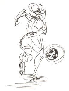
Also here's a little quick sketch i did in collage of some girl soccer players. Just for fun!