I am sorry for not posting more than i have this week, but as any of you know who are even remotely interested in the world of feature animation this has been a HUGE, MONUMENTAL, COLLOSAL WEEK!
It all started on Monday morning when i saw the headline "Disney buyout of Pixar?" I was thinking, what's up with the question mark, tell me more man! as i made my way through the article and the possibilties unraveled my heart began to race, my palms got sweaty, and my throat got dry. All of the things that my friends and i have talked about over lunch all of the sudden went from never happening to a very real possibility. I decided to choke back the tears, turn the computer off and try and do something constructive with my time. I have been to let down before by big news and i wasn't gonna let it get to me now.
Cut to (sorry, so used to film) Tuesday afternoon, i get online to see what the latest scoop is (not to mention i had talked to about 5 billion people by now). and there it read "Disney buys Pixar" and "Lasseter and Catmul to be heads of creative affairs inculding feature animation. I just about had a heart attack... it was almost like when Rudy in "Rudy" gets his exceptance letter to Norte Dame! I was freaking out man!! I spent the entire day with a headache because of the emotion of it all. I went to teach at CalArts that night as well and the school was partying man, total rejoicing. Like at the end of Return of the Jedi!
Cut to Wednesday morning... I had heard all of the rumors about John being interested in doing 2D again. but as i said before, i've been let down a lot of times and i wanted some smal bits of proof. Well, the first article i found was in USA Today. It was an interview with Dick Cook (chairman of the disney studios) and him being asked some of the tough question. One was whether 2D would come back. His response, "John and I have talked about reviving 2D for quite some time. It wouldn't surprise me at all if a project were found and we wanted to make it in 2D." Do you know how HARD it is to get straight answers like that from people so high up!?? Huh, do ya? That NEVER happens. no he didn't say yes, but he did admit that they WANT to revive it and that they are more than likely searching for the RIGHT story to tell in 2D. plus for any of you who know John Lasseter the guy is a fan. He LOVES animation, not just CG but hand drawn and stop motion. He just loves the art form!! What do i think, i think it's only a matter of time before we hear about them repening the division. The other amazing piece of information was that Johns first act in his new role at Disney was to shelve Toy Story 3. Bam baby!! and his reasoning, we should only do sequels if there's a good story. plain and simple, don't you just love it that way. the TRUTH, not the rhetoric that we're used too!
anyhow, all of that to explain why i haven't posted more this week. I am still working on getting another tutorials together for everyone on the face and how it works. It's just taking longer than i thought because of unexpected, joyous news. your thoughts?
Friday, January 27, 2006


Monday, January 23, 2006
Disney + Pixar = New Age of Animation?
I Don't hardly EVER write about politics in the entertainment/film world, but i have to admit THIS story has me by the throat! Just this morning I read on Cartoon Brew's website (www.cartoonbrew.com) about the possibility of Disney buying Pixar. You can read all about it for yourselves, but essentially what is happening is that today, this very day the Disney board and the Pixar board are meeting to either agree or disagree on a particular price tag for Pixar (notably 7 Billion buckeroo's). Now, when i read this i immediately thought of 2 likelihoods: either Pixar will have a profound influence on Disney for the better, or Visa Versa and Pixar will be brought down the tubes with Disney.
Now, personally i believe the first option is most likely. Why? For one thing, Pixar's Steve Jobs will have a prominant place on the board of directors. Given the success of Pixar's films, and being that Job's would have the largest amount of stock in the company would make is influence very very strong. Also, Jobs is similar, very very similar to Walt! He is a man who has built a company (apple) up based on instinct and quality. Tha is an over-simplification, but essentially he has vision of something much greater than making money! Walt always said making money bored him, i believe Jobs is the same way. He's a visionary that respects the creative process, thus, having sucha visionary with a very important voice on the Disney Board would be a huge influence. Lets not forget too that Roy Disney is also back with the company and has since gotten rid of a few people that we "bad blood" from the Eisner days.
The other part of the coin is that with Jobs and Pixar being apart of Disney it is very likely that Lasseter would become the head of Feature animation. Do you know how long it has been since an artist has been the head of animation? Not since Walt DIED... now, selfishly i must admit, this gives me knots in my stomach to think about (from excitement). Lasseter HAS NOT said that he would bring hand drawn back to disney, or that he would even take the helm of feature animation but, i have a strong inkling that he would. Lasseter LOVES animation... in ALL forms, and i think it would be a very smart business and artistic move to make Burbank the Hand Drawn unit and Pixar the CG unit. There IS room for both! but with Lasseter at the helm of both there is no telling where the art-form could go! just no telling!!!
Nothing is final, nothing has happened yet, for all we know the meeting today could go very poorly and things completely colapse. but imagine would COULD happen if things were to evolve in such a way. Maybe then my dreams of working on earth shattering films like INcredibles, Lord of the Rings, and Pinnochio could finally come true. Your thoughts?
Now, personally i believe the first option is most likely. Why? For one thing, Pixar's Steve Jobs will have a prominant place on the board of directors. Given the success of Pixar's films, and being that Job's would have the largest amount of stock in the company would make is influence very very strong. Also, Jobs is similar, very very similar to Walt! He is a man who has built a company (apple) up based on instinct and quality. Tha is an over-simplification, but essentially he has vision of something much greater than making money! Walt always said making money bored him, i believe Jobs is the same way. He's a visionary that respects the creative process, thus, having sucha visionary with a very important voice on the Disney Board would be a huge influence. Lets not forget too that Roy Disney is also back with the company and has since gotten rid of a few people that we "bad blood" from the Eisner days.
The other part of the coin is that with Jobs and Pixar being apart of Disney it is very likely that Lasseter would become the head of Feature animation. Do you know how long it has been since an artist has been the head of animation? Not since Walt DIED... now, selfishly i must admit, this gives me knots in my stomach to think about (from excitement). Lasseter HAS NOT said that he would bring hand drawn back to disney, or that he would even take the helm of feature animation but, i have a strong inkling that he would. Lasseter LOVES animation... in ALL forms, and i think it would be a very smart business and artistic move to make Burbank the Hand Drawn unit and Pixar the CG unit. There IS room for both! but with Lasseter at the helm of both there is no telling where the art-form could go! just no telling!!!
Nothing is final, nothing has happened yet, for all we know the meeting today could go very poorly and things completely colapse. but imagine would COULD happen if things were to evolve in such a way. Maybe then my dreams of working on earth shattering films like INcredibles, Lord of the Rings, and Pinnochio could finally come true. Your thoughts?
Wednesday, January 18, 2006
Walk this way!
Hi everyone! i took me a little while, but as promised here's the tutorial on a walk. It took me some time to get this one done for ya'll, i started teaching at CalArts this week. It's been a fun so far, but a lot of work and prep time. It's only helpful really. It forces you to make sure that what you think is right is really right. Cuz if you show them how to do something wrong then it'll come back to bite you in the butt later.
anyway, i chose a natural relaxed sort of walk to do for you guys. There are more than one method for planning a walk but the one that seems to work best for me is starting with your contact poses (key number 1 and 13). It's a dynamic way to start you walk. Starting with the "down" or the "up" is difficult and an akward way to start a walk. Art Babbit did it that way, and it worked for him but i find that for me the contact is much easier to understand. The second thing to think about is your beats and tempo. Mark on your x-sheet how fast you think he/she should be going. generally one step on a relaxed walk is 12 frames long. Which is more difficult to do because it means trickier charts. but we want what's best right? If you have less time than you'd like, you could put the walk on 16's so you could use 2's but then your walk is going to become a bit labored looking.
So anyway, I start with the contact drawings... you can either then put in the down or the up drawing. I find that i like to put the down in first... not sure why, maybe cuz i feel like i need to see that weight down first before i can do the up. anyway, once your up's and downs are in (key's 4 and 10) then you put your break down inbetween 4 and 10. This is KEY! it's ALL in the breakdowns! you can change everything in your walk by simply altering your break down, for good or worse. in this case i played it naturally. I tend to treat that breakdown drawing like a 3rd favoring the up. ya know? It gives more time in the up, and less time on the down which gives weight to the character.
 Now the tricky part about walks is that you have 2 sets of charts. Your horizontal path and your vertical. Your Horizontal, meaning the distance length wise he walks should always be even. 100 percent! Even steven...
 But your vertical charts are quite different... you can check out how these charts parrallel the drawing, but note that the last inbetween in a slow in or slow out is always on a 3rd in this case. As i've said before this isn't necessarily always the way it needs to be, but when your stopping and starting constantly like you are in a walk this IS the way to go. The reasoning for the 3rds is because if you put it as an even you would have even space inbetween your second to last inbetween and your key. That's very very bad when you are trying to convey weight.

Well, i hope that satisfy's every for a little while! I'm having fun doing these so i hope you all are still enjoying reading them. what i gave you today is more a template... because obviously there's a whole other element to walks that i DID NOT cover and that's character. This is a base template of understanding in which YOU need to caricature off of once you understand it. It's like, Picasso didn't start doing abstract (essentially caricature) until he knew how to accurate draw things. same is true here.
anyway, i chose a natural relaxed sort of walk to do for you guys. There are more than one method for planning a walk but the one that seems to work best for me is starting with your contact poses (key number 1 and 13). It's a dynamic way to start you walk. Starting with the "down" or the "up" is difficult and an akward way to start a walk. Art Babbit did it that way, and it worked for him but i find that for me the contact is much easier to understand. The second thing to think about is your beats and tempo. Mark on your x-sheet how fast you think he/she should be going. generally one step on a relaxed walk is 12 frames long. Which is more difficult to do because it means trickier charts. but we want what's best right? If you have less time than you'd like, you could put the walk on 16's so you could use 2's but then your walk is going to become a bit labored looking.
So anyway, I start with the contact drawings... you can either then put in the down or the up drawing. I find that i like to put the down in first... not sure why, maybe cuz i feel like i need to see that weight down first before i can do the up. anyway, once your up's and downs are in (key's 4 and 10) then you put your break down inbetween 4 and 10. This is KEY! it's ALL in the breakdowns! you can change everything in your walk by simply altering your break down, for good or worse. in this case i played it naturally. I tend to treat that breakdown drawing like a 3rd favoring the up. ya know? It gives more time in the up, and less time on the down which gives weight to the character.
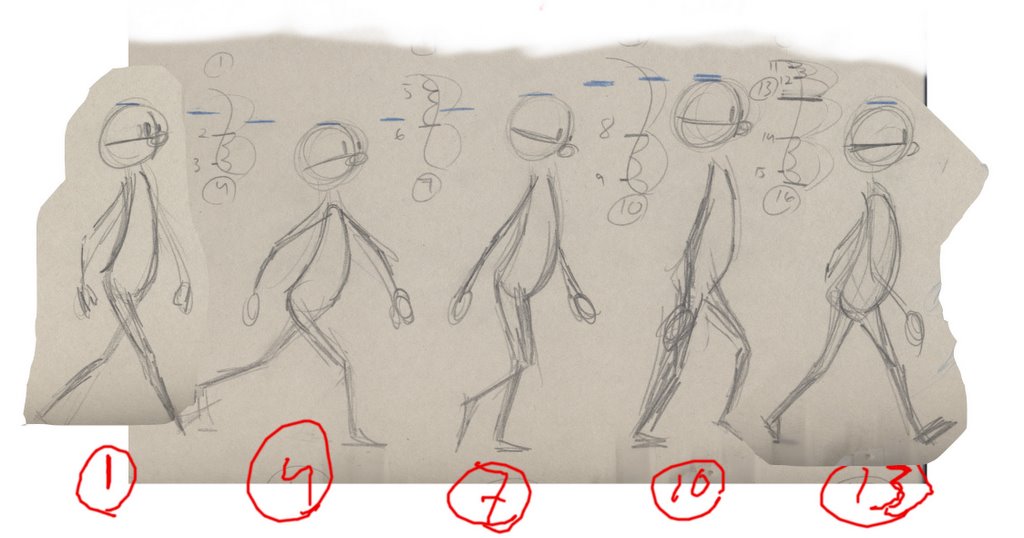 Now the tricky part about walks is that you have 2 sets of charts. Your horizontal path and your vertical. Your Horizontal, meaning the distance length wise he walks should always be even. 100 percent! Even steven...
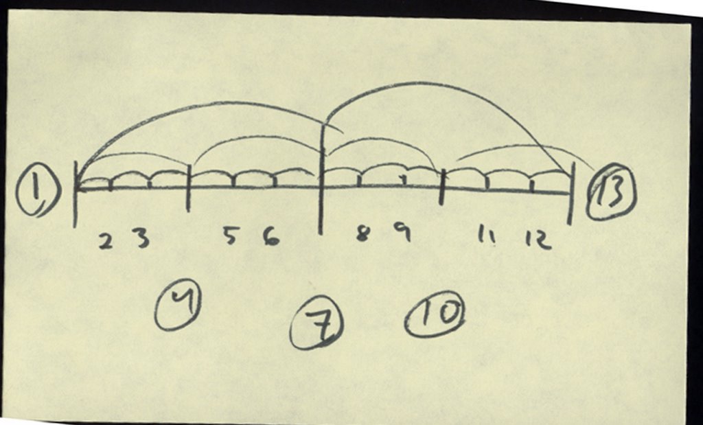 But your vertical charts are quite different... you can check out how these charts parrallel the drawing, but note that the last inbetween in a slow in or slow out is always on a 3rd in this case. As i've said before this isn't necessarily always the way it needs to be, but when your stopping and starting constantly like you are in a walk this IS the way to go. The reasoning for the 3rds is because if you put it as an even you would have even space inbetween your second to last inbetween and your key. That's very very bad when you are trying to convey weight.
Well, i hope that satisfy's every for a little while! I'm having fun doing these so i hope you all are still enjoying reading them. what i gave you today is more a template... because obviously there's a whole other element to walks that i DID NOT cover and that's character. This is a base template of understanding in which YOU need to caricature off of once you understand it. It's like, Picasso didn't start doing abstract (essentially caricature) until he knew how to accurate draw things. same is true here.
Saturday, January 14, 2006
Updated pencil test
I wasn't able to figure out the HTML so i'll have to add it in a later post, but click on the title and it should take you to the animation.
I hope everybody enjoys the next stage of the process for me on this pencil test. I've been busy writting all week, so i thought on Friday I'd finish roughing out the end of this test shot. The end still needs cushion inbetweens, but otherwise i'm happy. The drop down from the swing is a little slower than i'd imagined it, but i think it works especially since he's not dropping from that high. Does anyone this I need to respace this for more snap in the landing?
Next step is adding the tail (the hard part!) and then laying down the graphite line, and then finishing it with doing a color test! should be fun to watch it's evolution.
Next week I'm gonna do a tutorial on how to animate walks, the pit falls, mechanics, and most importantly the character behind the walk. until then, have a great weekend!
Thursday, January 12, 2006
Design Basics!
Hey Folks! I got a request to talk a little about design. Now, for sure i am not an expert on design but it is something i so completely wish i was more interested in when i was a kid. It wasn't until CalArts that i feel in love with design and saw how completely important it is to know what makes for a good design. Hand drawn or CG!
This first page here is just the very basic principle i'm sure you all know and that's finding your basic shape. Animation at it's best is about simplicity and finding the essence of something. Here Milt Kahl's Little John from Robin Hood is basically a rounded out triangle. That's his shape, when he walks on screen that's what you and i read and say "oh, it's Little John". This is why when your designing charactes it's important to keep their shapes distinct and personal unto them.
The other thing here is also the basic concept of keeping your purportions interesting. I used to think that meant totally caricaturing something to a point where it wasn't believedable. Like haing a huge huge guy with itty bitty legs. But remember these designs have to run and walk and jump, and act! So your design HAS to be functional. That's why the Cartoon Network stuff works well for what it is, is because it isn't being fully animated. Those charcaters can't turn. But these characters HAVE to turn. So remember to keep your purportion interesting. Even is boring!
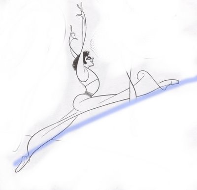
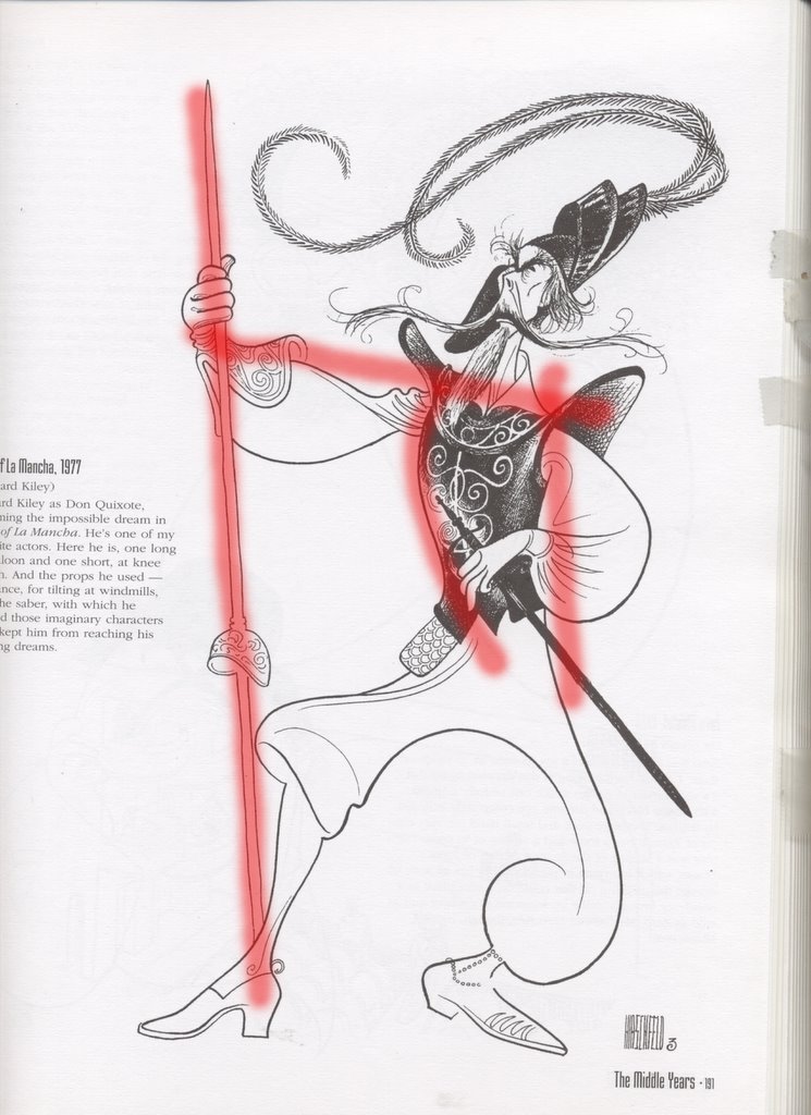
 Ahh, Hirschfield! who doesn't love this guy!? Another basic thing is straights and curves. The whole idea is finding a balance and a way for them to support each other. Some might find it ironic that i am using Hirschfield for the example of STRAIGHTS since he is known for his curvy streamline, but really look at it. He has IMPLIED straights, not literal ones. You can see this more clearly in the drawing at the very bottom. But in this drawings with the man holding the staff there is a balance of straights and curves in his design and gesture. The back, although it has a curve to it, is the straight that strengthens the curve of the chest in front. Makes the pose feel stronger. Incidentally, for gestures and balance, always have head somewhere over the main "supporting weight foot". If you don't the character will look like he's falling over.
 And here's our examply of implied straights. Not to much to say really besides, DANG THAT CAT COULD DRAW!
 I just wanted to say THANKS to the Spline Doctors for plugging my blog! It was awful nice of'em and they didn't have to do it but i appreciate it. Doing these tutorials has been fun and i hope everyones enjoying them. I am going to get more back into animation with the next few tutorials, but in the mean time i m gonna finish this script and try and finish a piece of animation. Willermess out!
This first page here is just the very basic principle i'm sure you all know and that's finding your basic shape. Animation at it's best is about simplicity and finding the essence of something. Here Milt Kahl's Little John from Robin Hood is basically a rounded out triangle. That's his shape, when he walks on screen that's what you and i read and say "oh, it's Little John". This is why when your designing charactes it's important to keep their shapes distinct and personal unto them.
The other thing here is also the basic concept of keeping your purportions interesting. I used to think that meant totally caricaturing something to a point where it wasn't believedable. Like haing a huge huge guy with itty bitty legs. But remember these designs have to run and walk and jump, and act! So your design HAS to be functional. That's why the Cartoon Network stuff works well for what it is, is because it isn't being fully animated. Those charcaters can't turn. But these characters HAVE to turn. So remember to keep your purportion interesting. Even is boring!
 Ahh, Hirschfield! who doesn't love this guy!? Another basic thing is straights and curves. The whole idea is finding a balance and a way for them to support each other. Some might find it ironic that i am using Hirschfield for the example of STRAIGHTS since he is known for his curvy streamline, but really look at it. He has IMPLIED straights, not literal ones. You can see this more clearly in the drawing at the very bottom. But in this drawings with the man holding the staff there is a balance of straights and curves in his design and gesture. The back, although it has a curve to it, is the straight that strengthens the curve of the chest in front. Makes the pose feel stronger. Incidentally, for gestures and balance, always have head somewhere over the main "supporting weight foot". If you don't the character will look like he's falling over.
 And here's our examply of implied straights. Not to much to say really besides, DANG THAT CAT COULD DRAW!
 I just wanted to say THANKS to the Spline Doctors for plugging my blog! It was awful nice of'em and they didn't have to do it but i appreciate it. Doing these tutorials has been fun and i hope everyones enjoying them. I am going to get more back into animation with the next few tutorials, but in the mean time i m gonna finish this script and try and finish a piece of animation. Willermess out!
Tuesday, January 10, 2006
Gestures: The Revenge of the Tutorials
I've gotten a few request recently to start doing more tutorials again! I had stopped doing them cuz no one, except my friend Steven MacLeod www.clockroom.blogspot.com was responding to the posts. but i am very happy to start some up again! the first request i got was to talk about gestures. Everyone ought to check out what Andrew Gordon wrote on his site about gestures, it's pretty good stuff. I thought it was funny i got asked to write about draftsmenship cuz it's what i consider to be the weakest part of my animation. Soooo, we will not be looking at any of my drawings today that's for sure. today we study KING KAHL! The main point of your gesture is to tell someone something! It is meant to reveal how the character is feeling on the inside. Sometimes you down play things, sometimes your over play them, it all depends on the scene you have and who the character is. Milt is famous for his draftsmenship amoung other things, and all of his poses are crystal clear. shapewise and storywise. I HIGHLY recommend stop framing anything he touched. I think Sher Kahn is a great example of underplaying. Milt, in some scenes hardly moved him at all even though the dialogue seemed to be doing more. He was underplaying the character... he was confident enough in lingering on a facial expression of using the eyes that he didn't feel the need to use these broad poses. but them there is Madusa who is overplayed, because it's her character. I picked a few drawings that i thought were amazing gestures for different reasons.
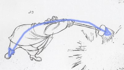 Now, i'm not trying to limit these drawings, i am just pointing out 1 amazing thing about them. Check out the Line of Action. You really feel the power behind that broom, but consider the character as well. Snoops is a sloppy guy, and doesn't really think to far into the future. He's clumsy and a bit stupid, so his gesture reflect a sloppiness to him. a one tract mindedness.
 Now, i'm not trying to limit these drawings, i am just pointing out 1 amazing thing about them. Check out the Line of Action. You really feel the power behind that broom, but consider the character as well. Snoops is a sloppy guy, and doesn't really think to far into the future. He's clumsy and a bit stupid, so his gesture reflect a sloppiness to him. a one tract mindedness.
 Rythm is basically when shapes are working into the line of action, and each other. another person who does this beautifully, in my estimation is Eric Goldberg. This drawing of Snoops uses rythm to desrcibetwo things: a shifting in weight, and tension. He is obviously turning over (shifting weight), and his arm stretching is the constrast of tension compared to the squash of his arm were all the weight is being transfered too. note though that shapes in into eachother, his arms make an arc as well as his legs.
 Getting a good gesture is all about clarity... is it clear enough? Glen Keane once told me something that Ollie told him, "it's not about drawings clean, it's about drawing clearly." Silhuette is the test we all use to make sure out poses are reading as simple shapes. This is a beautiful example of such. My advice on finding a good drawing is DON'T BE AFFRAID OR TOO LAZY TO REDRAW SOMETHING. Often times i go through 4 or 5 drawings before i find a good one, maybe that makes me a weaker draftsmen but i think Milt did it to. His results were a bit different than mine are obviously. but experiment, push the pose!
I feel bad compartmentalizing these drawings. There so much beauty to be seen in them that you can't just point out one thing. but for now i guess this'll have to do.
Monday, January 09, 2006
Last of the color models!
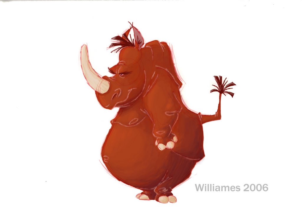 Hi Folks! Had one heck of a weekend! Saw some really beautiful country, shot some guns, and walked through some incredibly cheap houses! I thought i'd share the last colour model with you guys. I haven't added any texture to this yet, i haven't been able to find one i like yet. So, now all the color models are done, at least until i change the script, which WILL happen. speaking of the script i need to finish it! so enjoy this pic for the day, by the way anyone can comment on the color. As i've said i'm not an accomplished painter by ANY means so please any helpful hints would help. cheers!
Friday, January 06, 2006
Outta here for the weekend!

Welp everyone, or, the 3 people that read this everyday. pretty pathetic, i know. Anyway, i'm off for the weekend to Tehachapi with my wife. yeah man! we're gonna shoot some guns, ride the oddyssy (a dune buggy), and just plain have fun in the country!
I thought i'd share this new color model i just finished of the main character of the short. I'm trying to get a few of these done for pitching reasons. Note on both these i tried adding and outside source for texture, namely, a napkin! it was more successful on the alligator, you can see it on his skin. Now, what if that could stay consistent on the character and stretch and squash with him or even more subtley like when he moves his arm. I think that would be flippin' cool. This is kinda what i want the film to look like... maybe i'll work out some sort of system were i can matte the characters with a consistent texture. wouldn't that be sweet!? any thoughts? have a great weekend everyone!
Sunday, January 01, 2006
Happy New Year
There's no way to say "happy New Year" quite like a pencil test! I was working on this a while ago, it's obviously not done and it's more complete than this test shows you, but check it out!
Monday, December 19, 2005
Sunday, December 18, 2005
KING KONG

Here's a little development art i did for the film. ha, just kidding. This drawing is actually really old, but i still like it. This post is decidedly about KING KONG. I just recently saw it Friday night, i wanted to see it Wednesday morning at the 12 am showing but it didn't work out. But all i have to say is WOW. i absolutely loved it, in fact, i can't stop talking about it. I know some people are predicting that it won't be a hit, but a movie that costs 207 million to make is hard for it to become to a financial hit. as far as i'm concerned though it is definately an artistic success for sure!
You got to films wanting to feel something. Wanting to have an experience. I felt everything i wanted to feel and that's hard for a fellow filmmaker to get that way because i know it's all fake. It's even harder sometimes for me to take that leap emotionally, but when i film takes even me there i know it's powerful.
Sure, there were somethings i would have done differently, maybe would have trimmed up some spots editing-wise, and yeah, there were even some bits of animation that i thought could have been a tiny bit better. But then, there were WAY more moments that made me go "wow", or feel incredibly sad.
Anyhow, the point of it all is GO SEE IT. You don't even feel the 3 hours. honestly, your just sucked into it.
Saturday, December 03, 2005
Finally! some time to write!
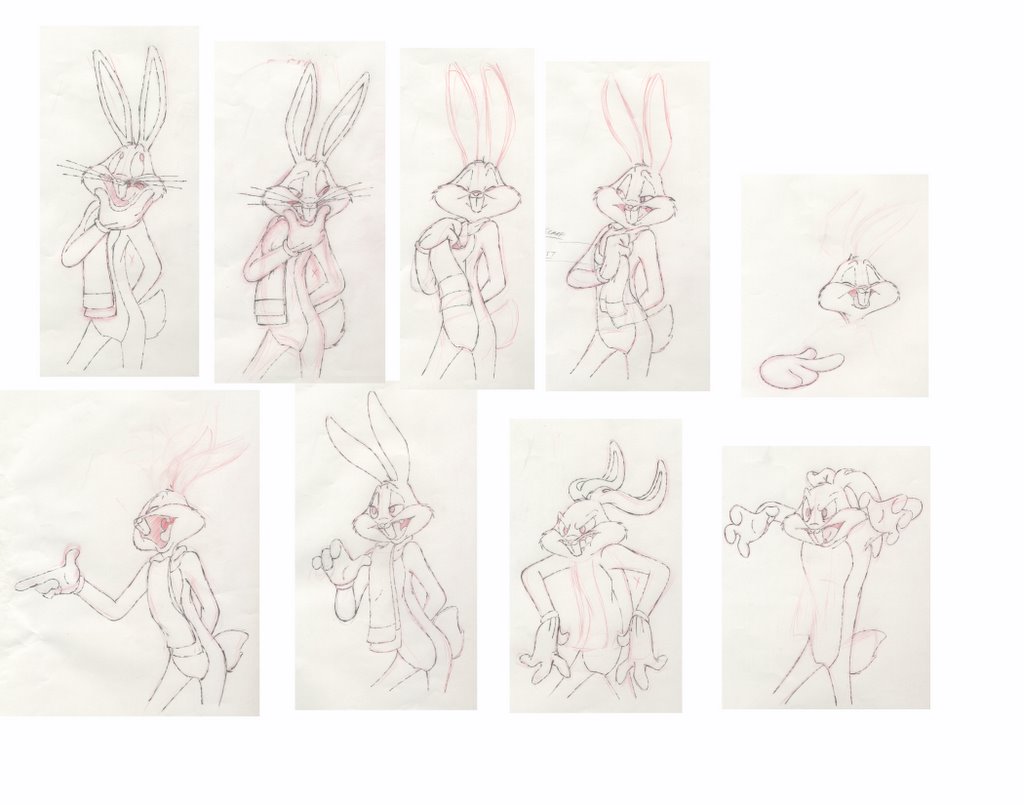
Ahhhh, finally a little time to write! Sometimes life can be all consuming unfortunately. It can be difficult to keep a good balance. especially when your an animator. It seems that there's always time to fix animation, but never time to do it right on the first try. I have been back at warner brothers working on this looney tunes christmas special thing. most of it is being animated in Korea, but we're keeping a few shots here for us to animate, and posing out some other scenes. It's funny, as a kid i never liked drawing the looney tunes. I always liked the disney stuff the best, and i still do i guess. But i can't tell you what i've learned from doing the warners stuff. Someone once accused those characters as being "easy" to draw. they obviously never has drawn them himself. Yeah, there are tougher characters, but you try it. Some of them are hard! Mainly Bugs, Daffy' s a little easier, but bugs is a booger. The thing that you learn when drawing and animating these characters is that emotion dictates the design. these characters are all about good design. They really teach you to loosen up and have fun with the design. Pushing it, pulling it, caricaturing it. And frankly, that's what animation is best at. Not that Prince of Eygpt live action crap. Yeah, some of it was beautifully animated, and well performed, but i don't think anyone liked drawing that stuff. It has very little, to NO appeal. these characters do. So anyway, here's some stuff i've been working on since i last wrote. later everyone!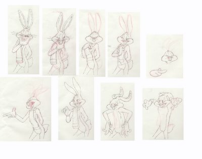
Sunday, November 13, 2005
Ball Bounce
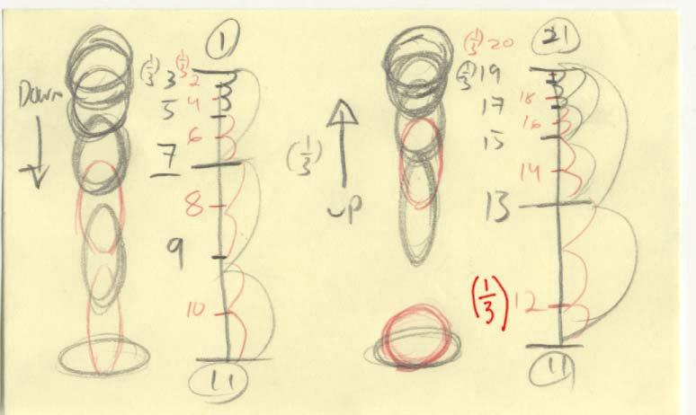
Ahhh, the infamous ball bounce. But there is much to learn from this simple animation exercise. Physically speaking, it's got most of the animation principles rolled up into one test. But today i will focus on spacing, planning for ones, and contact.
Spacing is obviously half of what will or will not make this work. Note that the chart on this ball bounce is not the same for both the "up" and the "down". On the Down I made the dropping slightly more 'even' than the bounce back on the 'up'. It seems to me to feel more natural, and the sharp gap in spacing on the up give the ball a feeling of intention, like it's really trying to bounce. The only problem with the spacing is the gaps. BTW, All lines in graphite are the odd's (on 2's), and the reds and the added inbetweens for ones. Anyway, the gaps on the graphite lines don't overlap. And when things are on 2's and they don't overlap your animation will "strobe". That's when you can see the actually drawings kind of flicker a little. that's bad! So, to fix the problem we need to add ones. This isn't always easy. it's not a matter of simply putting even inbetweens in there, you gotta plan for ones. In this case, because it's a ball bounce, we need the feeling on 'contact' when the ball hits the ground. For this we need at least 2 frames for the contact to read properly. So imagine you just evenly inbetweened this stuff when it went onto ones, you'd lose that 2 frames of squash contact. So what i did was evenly put 10 as a strech drawing touching the ground to avoid strobing and placed 12 as a 3rd to 11 still touching the ground. Thus we maintain the gap of space on the 'up' needed for spring and maintain also the contact we need.
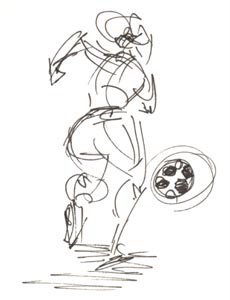
Also here's a little quick sketch i did in collage of some girl soccer players. Just for fun!
Saturday, November 12, 2005
Motion Analysis
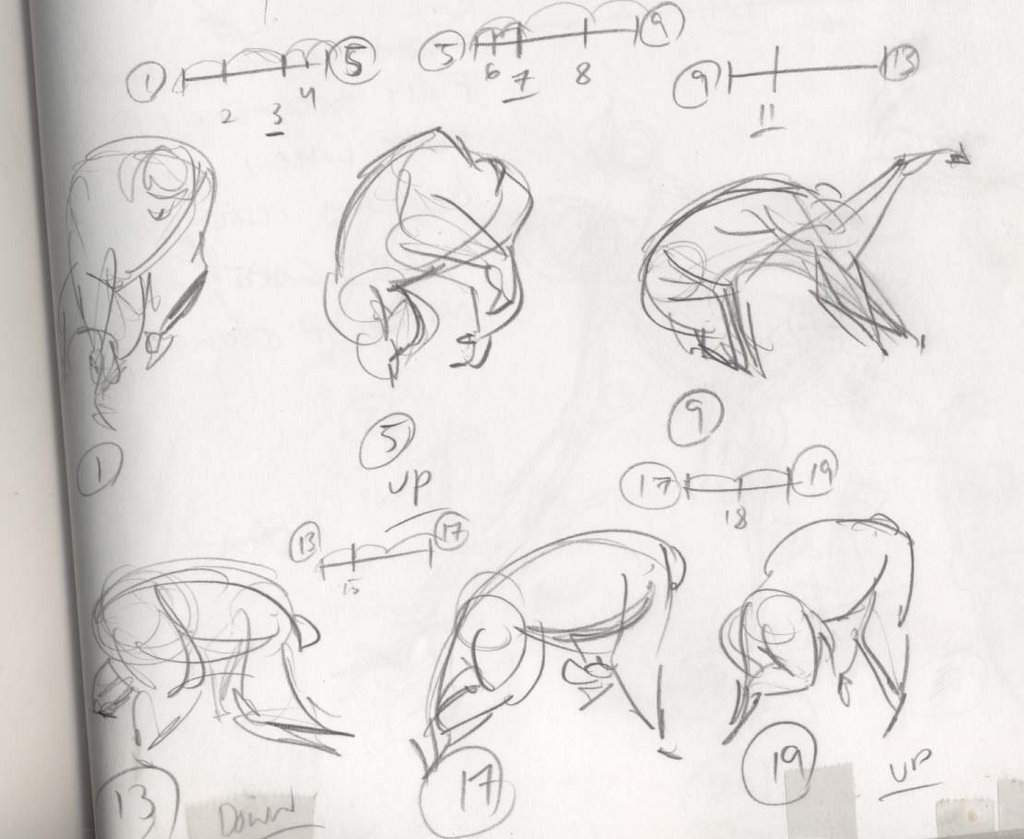 These are some motion analysis doodles i did before i started work on Curious George. Unfortunately i never got the opportunaty to use very many "monkeyisms" in the film... that's something i think the character of George might lack a little. So yeah, i totally recommend anyone going into animation whether CG, stop motion, or hand drawn study relentlessly live action footage. It is our basis from which we caricature... if we don't know what's really then how can we caricature BELIEVEABLE performances. believeable is the word, not realistic. if you want realistic shoot live action. anyhow, i do these as often as i can. and seriously, stop frame everything! study weight distribution, what does the body do to prepare itself to change direction, how long frameage wise will i need for that contact (rule of thumb: for contacting an object with another at least give it 2 frames of contact to read). Recently i've been studying eyes and how the eyes dialate in certain emotions, wrinkles for certain emotions. The face is a fascinatingly complex thing to study. oh by the way, ignore the charts on these pages, they're wrong!
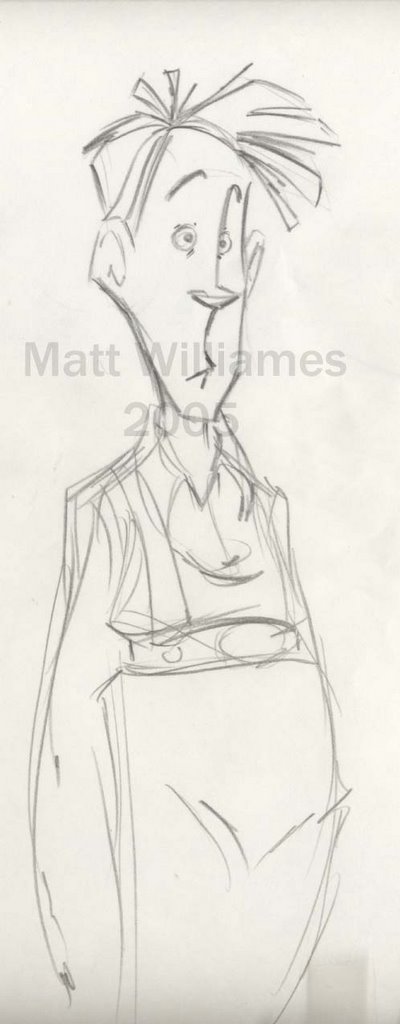
This week was a busy one! we are getting ready to ship out stuff to over seas on monday :(. I am finishing some mouth charts for them right now. they pulled me off from animating to help get these done. Just finished posing out a shot of Daffy falling through a tree and hitting every branch on the way down. Got to hit a lot of fun graphic shapes! hopefully Korea will inbetween in correctly. here's hoping! So i thought i'd actually post a real drawing for once. I've been so busy drawing things that i'm not aloud to post that i haven't have much to share recently. so check out this character design i did.
Monday, November 07, 2005
More Notes on Spacing
 Good evening folks! back here with some more notes on spacing! this is a simple trick that most people know, but some neglect to use. When your doing a head shake, say on 4's, make your inbetween favor the previous key as a 3rd. If you evenly inbetween, it will look mooshy and not have any punch or weight. The more physical explanation is that things need time to start moving and stop moving. Therefore, the excelleration is at it's height on frame 5 (see pic above) which is why the gap of space between3 and 5 is the largest. Now, if you want to put it onto 1's i've added another chart right below to show you how you could transfer that info into 1's while keeping the weight you need.
Work was pretty good today, am doing some shots that require me to more fully plan out stuff. So am basically animating, but were not calling it that because the big wigs at Warners don't like that word!
Has anyone seen the new King King trailer? Pretty flippin' sweet if you ask me! pretty sweet. Seeing stuff like that just maes me LONG for cool projects to grace the face of hand drawn animation. I have enjoyed working on films like Curious George, or Looney Tunes: Back in Action but i have never felt the concern of letting the film down. ya know? i usually feel like i am trying to make so-so ideas work in my animation instead of trying to live up to something. I also LONG for depth. I've heard so much junk about how hand drawn just can't get the facial depth that CG can. Yes, there may not be all the detail that a CG model would have but the depth of performance is just as much a possibility! Just look at Sergio Pablos' Doppler stuff, or James Baxter close ups. Both those guys get sublty... so again, i really long for one really amazing film to grace the face of hand drawn animation. Maybe Brad Bird will eventually do "Ray Gunn" in hand drawn? who knows.
Anyhow, hope everyone enjoys these notes! Someday I'll find time to post more drawings up! cheers!
Sunday, November 06, 2005
Making Characters Breath
On Monday i was starting work back at Warners and had a little time to blow till' they got me all set up for work so i decided to drop by my friend Frank Molieri's room. Frank is the best animator i've never heard of before. I met him on LooneyTunes and he's one of these guys that no one has ever heard of before but can draw the cartoony stuff like you wouldn't believe! he's also be an incredible friend to me... i owe him a lot. so anyway, as i like to do i showed Frank some animation i had done from Curious George and some of my own personal stuff. I like showing him cuz he's encouraging, but also very honest. sometimes to the point of bluntness, but i'd rather have it that way that have it sugar coated for sure! anyhow he watched my reel, said a lot of nice things and then made the infamous "but". and i looked at him and saud, "but what". He smiled and looked at me like he had me cornered and was gonna check mate me. He said "Matty, your characters don't breath." It was one of those comments that sorta hits you in a funny way cuz of the truth in it, and the humilation that you haven't thought of it yet because it's SO obvious! There are times in shots were i've thought about making a character take a breath for a pause or something, but it is NOT a usual part of my thinking. I haven't really ever built it into the performance. It's not a litteral rib cage expanding and closing kind of thing, just building into the performance kind of a thing.
The other thing i've really been anxious to study more is eye lids. I've studied eyes quite a bit, but i've really been wanting to get into eye lid stuff. There is so much intricasy to the social triangle (mouth, eyes, eye brows, nose).
Speaking of eye brows, here's something i tend to do when i am animating close ups. The muscles that make your eye brows move up and down and very short, so when they contract it makes a very short quick motion. The same is true of your eye balls-- notice how eyes tend to dart, not move smoothly. anyhow, when animating eye brows i will make the cushion drawing very close in spacing and not last long. in other words it you are moving from 1 to 7 i would make 3 and 5 3rds. as always, i have to warn that this is NOT to be used all the time but generally, for natural eye brows this works great.
i suppose that's enough for now everyone, stay tuned and i hope to write a lot more this week than i did last week. cheers!
The other thing i've really been anxious to study more is eye lids. I've studied eyes quite a bit, but i've really been wanting to get into eye lid stuff. There is so much intricasy to the social triangle (mouth, eyes, eye brows, nose).
Speaking of eye brows, here's something i tend to do when i am animating close ups. The muscles that make your eye brows move up and down and very short, so when they contract it makes a very short quick motion. The same is true of your eye balls-- notice how eyes tend to dart, not move smoothly. anyhow, when animating eye brows i will make the cushion drawing very close in spacing and not last long. in other words it you are moving from 1 to 7 i would make 3 and 5 3rds. as always, i have to warn that this is NOT to be used all the time but generally, for natural eye brows this works great.
i suppose that's enough for now everyone, stay tuned and i hope to write a lot more this week than i did last week. cheers!
NEW POST NEW POST!
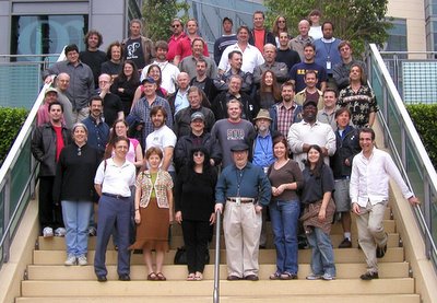
AHHHHH, the old days of feature animation. This whole last week you've probably noticed that i've be quite absent. well, it was a real busy week with a lot of early mornings. I've been back at Warner Brothers Animation this week. and honestly i am thankful for the pay but the work is slightly boring. I've been doing Character Layouts, and in TV it's all about quantity NOT quality. So, i've been thinking back to those greats not so distant days
when i got paid to work on features. This photo right below is of the Looney Tunes: Back in Action crew. I was 20 when i was working on that thing. I'm wearing the navy blue shirt with the yellow letters in the top right. Eric Goldberg is in the bottom center.
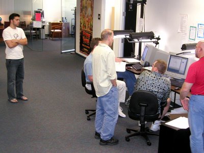
 Here's another one of me watching a little approval session with Jeff Sergey and another animator.
I'll try and dig up something cool to talk about soon... but for now i must jet. later!
when i got paid to work on features. This photo right below is of the Looney Tunes: Back in Action crew. I was 20 when i was working on that thing. I'm wearing the navy blue shirt with the yellow letters in the top right. Eric Goldberg is in the bottom center.
 Here's another one of me watching a little approval session with Jeff Sergey and another animator.
I'll try and dig up something cool to talk about soon... but for now i must jet. later!
Sunday, October 30, 2005
Spacing: Tricks of the Trade
 Good evening class! This one goes out to all you animation students out there... hopefully EVERYONE from the CalArts guys up to working professional still consider themselves students. anyhow, today we talk about the technique behind spacing. This, i feel, is something few animators truly understand. There is always a balance between your concentration between technical stuff, and performance but i feel that without proper execution of technique your performance will not be as powerful as it could. Different animators value it differently ie: Glen Keane vs. James Baxter. I personally take the view that if your technical stuff is off it could potentially ruin the performance because when that ear slides all over your characters head, or he just doesn't have the weight he needs it could pull you out of the moment.
Here is a very simple trick that can really help you on your slow in's and slow out's in a shot. Looking at the pic above you'll see that all the inbetweens are halfs EXCEPT number 3. It is on a 3rd favoring 1. The reason for not putting it on an even is because the space between 1, 3, and 5 is even. Even spacing will KILL weight and give you a watery look. What's funny is that not many guys use this method. Even skilled experienced guys! but you, now you can have to upper hand on your spacing!
Now, this IS NOT a 100 percent "always use this chart" kind of a thing. Sometimes you want a watery look, in which case this would not be useful. Or, if your slow in is about 36 frms long you may not need to put your last inbetween on a 3rd because the spacing would be so tight that you wouldn't feel it.There are lotsa different scenarios about why it could not work but if you want something to be progressing or degressing in speed, this is the way to go!
anyhow, Matt Williames signing off for now. Next post will cover some more tricks of the trade on spacing! later!
Thursday, October 27, 2005
CURIOUS GEORGE
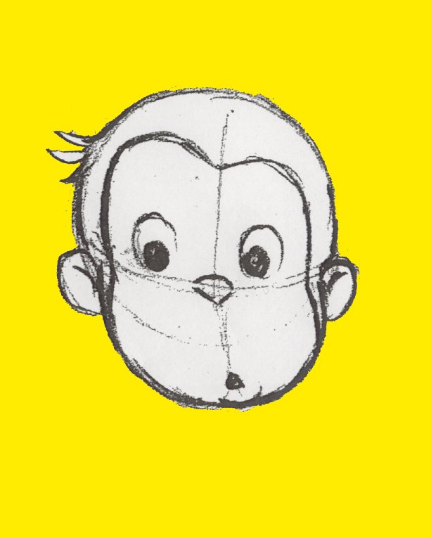
Today i thought i'd write a little bit about the upcoming Curious George. I've been hearing a lot of bad mouthing about the film, and I think, frankly, a lot of it's unfounded opinions by people who just like to have an opinion or feel like that it's the 'popular' opinion to have. I worked on the film, and i have to be honest and say that i think the first screening was pretty weak. I walked out of the screening room shaking my head like everybody else thinking "this is gonna suck." But as the film progressed and animation started getting approved, i really liked how the performances started to add a dimension that wasn't percievable while watching the story reel. Plus, i have to say that i think Matt O'Callaghan (the director) really did a great job in reeling everything together. Once he replaced the last director he started over from scratch, and from what i heard the film needed it. Plus he was overseeing animation from probably at least 12 different studios. He was always cool and collected when i would have my approval sessions with him, and some people would flip out with that kind of pressure and treat others around them poorly. Is the film going to be an Incredibles? No. Is it gonna be better than the last few Disney features? Heck ya! My point is that it is what it is... it's a fun film and i think people are gonna enjoy it.
Subscribe to:
Posts (Atom)